Cherrypickers

Hey Everyone!
We are super thrilled to present a case study of our project, Cherrypickers done in the recent past.
For this project we created the visual language and identity, designed the web UI, and also helped strategize the brand.
Cherry pickers is an all-inclusive marketplace that aids customers from discovery of products namely flowers and cakes to the delivery of these products. It offers customers highly personalized options of handpicked flowers and artisanal cakes baked and crafted by talented bakers, making it stand out. It's a one stop shop for all celebratory moments
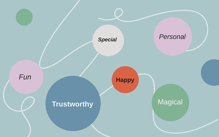
Brand Personality
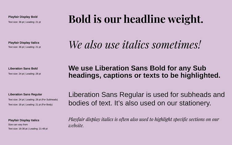
Use of Type
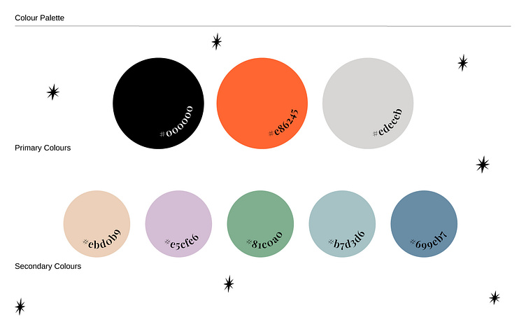
Colour Palette
The brand colors are warm and are associated with the strong emotions of love and affection. They signify excitement and vibrancy which are core to our brand personality. This helps keep the brand visuals bright, subtle and modern.
Logo Design Process

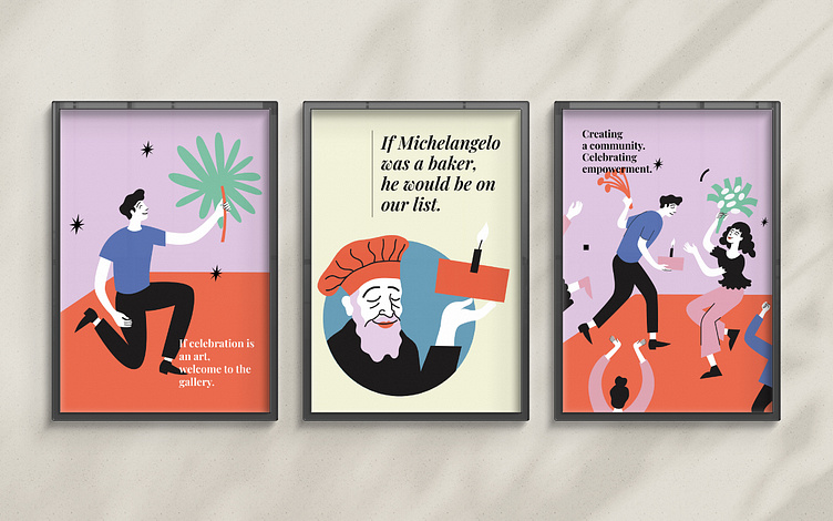
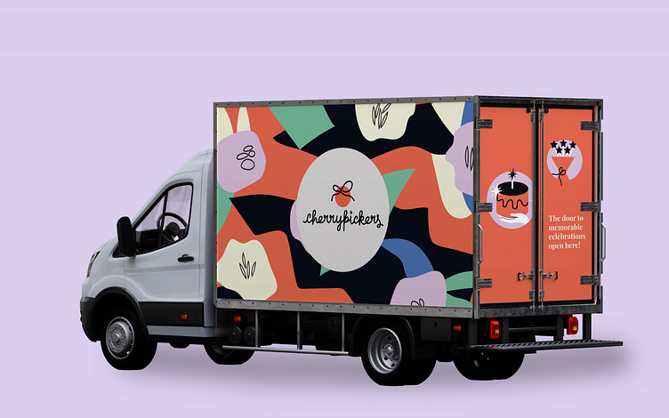
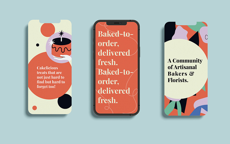
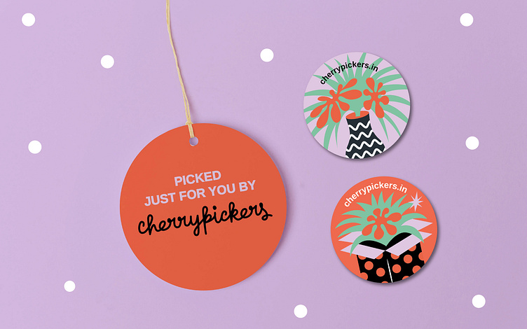
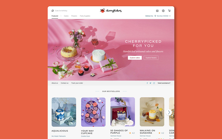
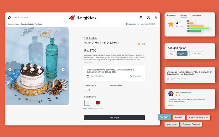
Brand in Action
Brand photography/ Product styling
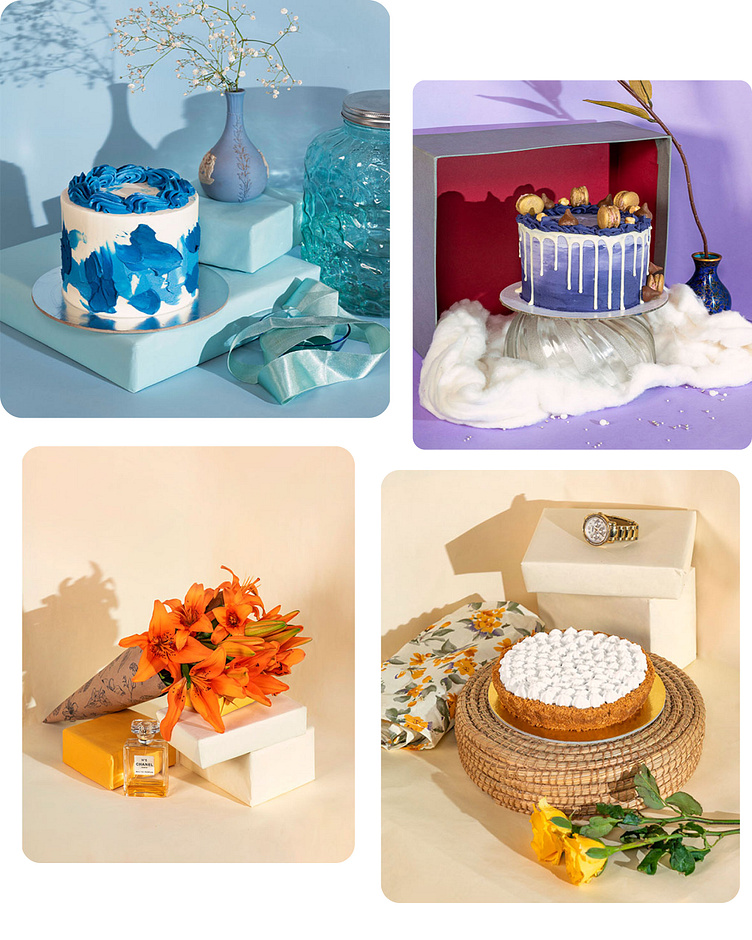
Cherrypickers platform offers users to personalize their orders to the next level. Choose your design, flavour and even write custom messages to the loved ones you are gifting through the platform. All of the above features are tied together with a bow creating a seamless user experience.
Conclusion:
Project after thoughts. Value of brand strategy and brand experience