AssetExplorer | Fintech Web App

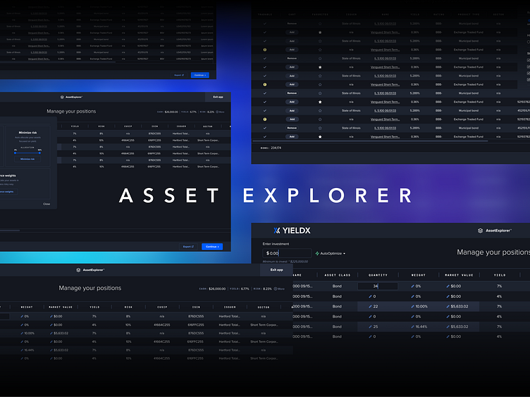
AssetExplorer is an app within the YieldX platform that allows users to access, analyze, and optimize bonds & ETFs.
Reducing clutter. Improving clarity.
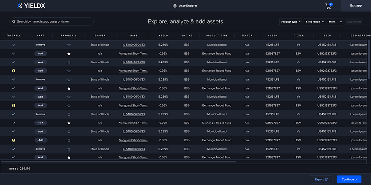
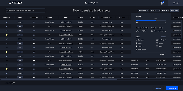
Problems
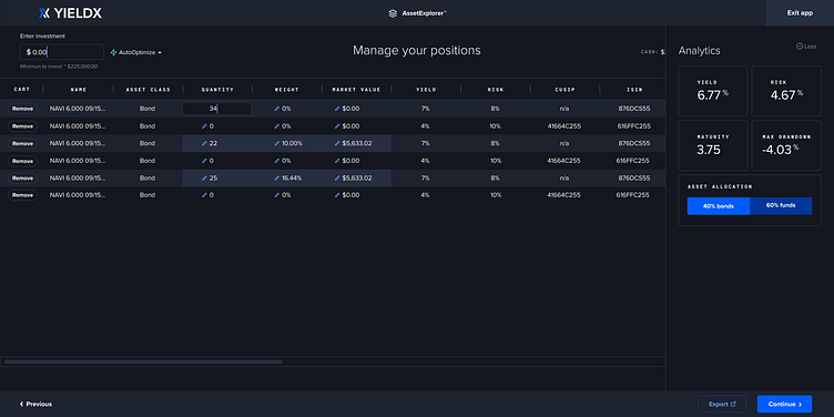
The initial design had large, clunky filters.
All filters were exposed & taking up valuable real estate.
The add/remove buttons were text buttons, which blended with the non-interactive text.
Solutions
I redesigned the filters to be extra small.
I placed the less important ones hidden under the "more" dropdown,
I created oval buttons to breakup the visual monotony.
Guiding the user's attention
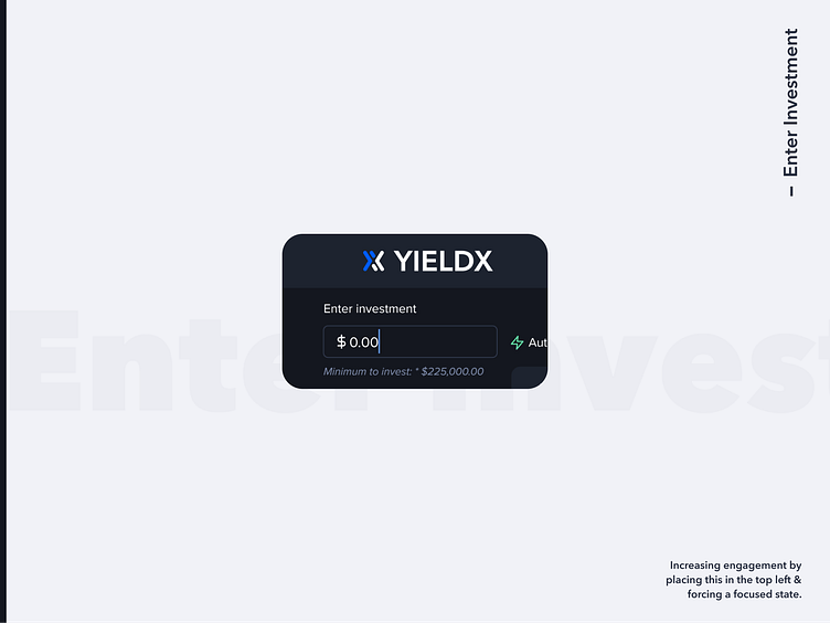
Problem
There was no clear place to start interacting with the app. Everything was calling for attention, so nothing stood out.
Solution
The first idea was to guide the user through using step numbers. However, after a bit of discussion, we learned that there was no "required" place to start - only a "recommended" one.
So, I decided to move the "Enter Investment" input to the top left (where 80% of users spend their time) and use a forced focus state so that the cursor is blinking when the user lands on the page.
Easy as pie, real-time editing
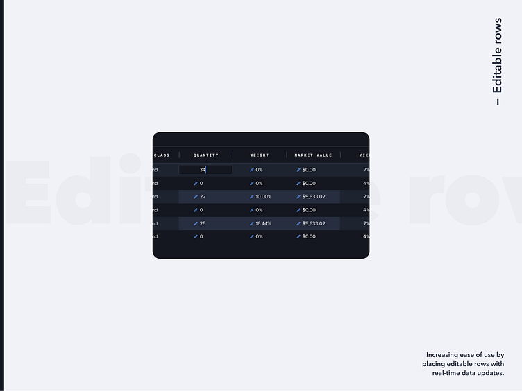
Problem
Before, we had the input fields separate from the row itself. This required users to scan back and forth while editing, which was a huge barrier to effectively optimize.
Solution
I moved the editable rows to the front and created an interaction that allowed users to edit right there on the row itself. Each editable row had an edit icon. Upon clicking, the user would see the focused input. The moment they typed a number and hit enter, new data would populate.

Hidden Analytics?
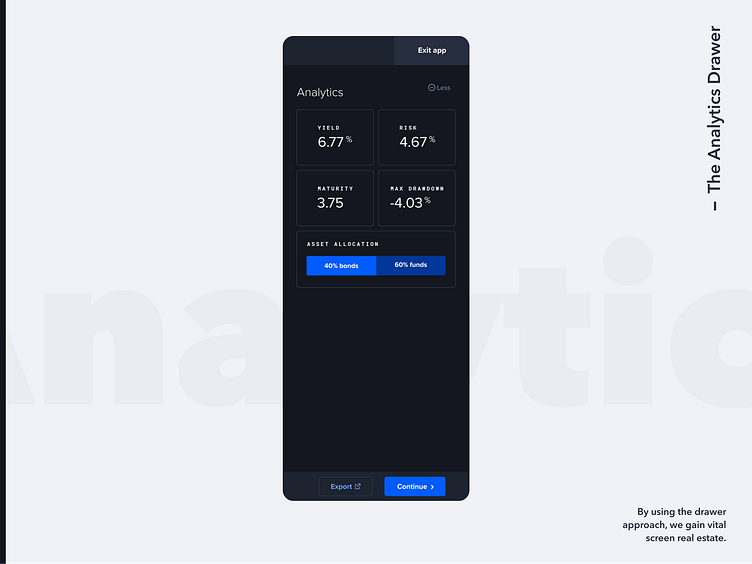
Problem
Initially, the analytics were exposed and taking up valuable real estate. In addition, something we learned along the way was that the user's preference for analytics at this state in the flow wasn't very high.
Solution
We created an analytics drawer so the user could open or hide it at their leisure. This opened up valuable screen real estate, as the assets themselves need the full screen to show each column.

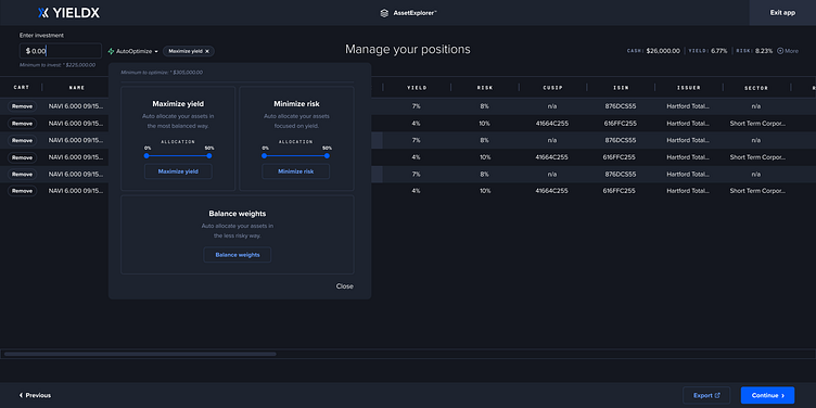
Branding a new feature
Problem
The initial design had powerful features that optimized assets with the click of a button. However, this was not obvious. It was hidden on the bottom right with unclear copy and clunky components.
Solution
I consolidated everything into a single text dropdown with a little green lightning icon.
I used the color green to stand out, to stay within our cool tones, and to establish a feeling of "go!" (at least with our western users).
Lastly, I made sure to give it a catchy name that entices users: AutoOptimize. The idea was that by branding it, it would be perceived as a legitimate, powerful tool.