Redesign Trello


Hey Folks, This is my last redesign for Trello web application. I decided to redesign Trello to make it more simple and useable. I also added some idea to improve the user experience.
Renewal
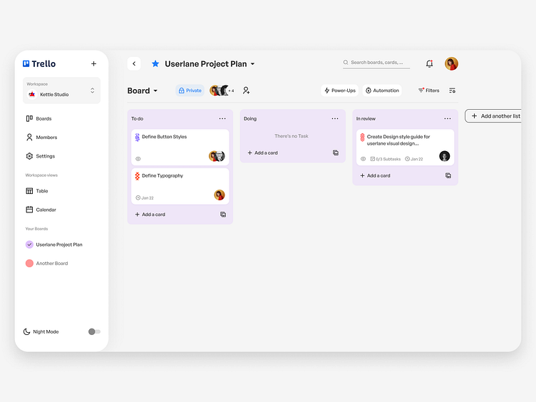
Trello looks very messy in its current version. In order to make the page more user-friendly and understandable, I used a hierarchy for the contents. The use of whitespace and visual grouping allowed me to create different meaningful sections. I was pleased with the result. It was clean, simple, and engaging.
Dark mode
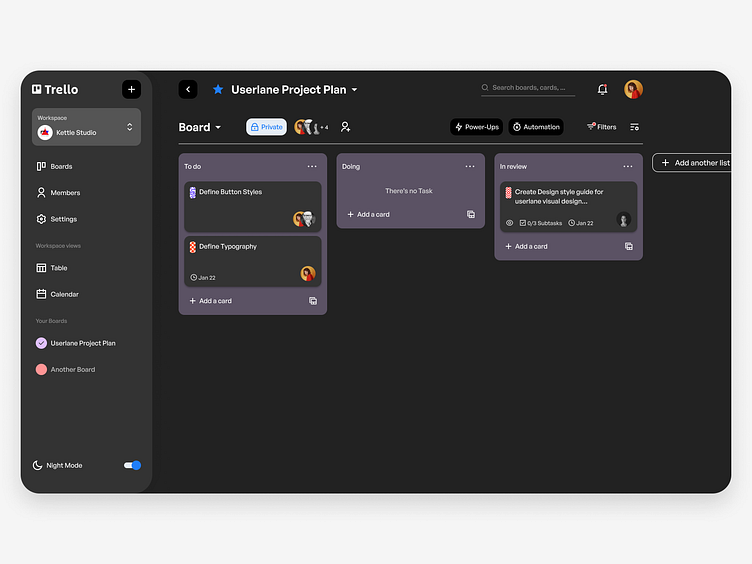
Currently, Trello uses color for the whole background to make boards look more specific. I decided to change the idea a little bit and make the backgrounds of the lists changeable instead of the whole board. With this solution, we are able to have the Dark mode and Light mode for the boards and avoid the bad experience of using a sharp color (or a messy image) as a background.
Patterns
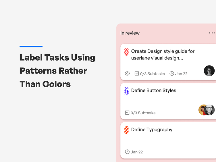
Another idea was to label tasks using patterns rather than colors. People with color blindness disability can't differ the colors so labeling tasks with colors will not help them. Using patterns makes the application more accessible for people with color blindness disability.
By using my experience in product design I tried to make a better version of the Trello web application. I hope you enjoy it. As always any comments are welcomed.