Branding - Geocac

🇧🇷Branding desenvolvido para a empresa Geocac.
A marca foi construída pensando em utilizar elementos que pudessem trazer a representação da geolocalização. Por isso, foi elaborado o ícone de GPS no lugar da letra ’O’, no qual, foi feita uma junção de elemento e fonte.
A fonte utilizada trás seriedade e amplitude visual, uma vez que é empregada em caixa alta. O intuito é causar ao usuário algo que traga um sentimento de grande valor. Já as modificações da fonte, que contém os cortes, são para conduzir exclusividade à marca.
A cor definida foi o azul por trazer confiança, força, profissionalismo e credibilidade, que encaixa-se perfeitamente com os valores da marca.
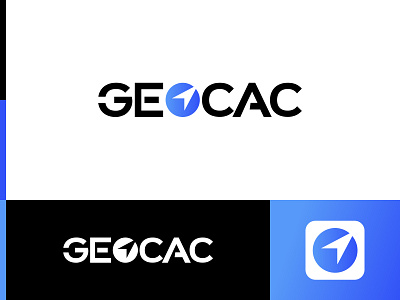
🇺🇸Branding developed for the company Geocac.
The brand was built thinking about using elements that could bring the representation of geolocation. Therefore, the GPS icon was created in place of the letter 'O', in which a junction of element and font was made.
The font used brings seriousness and visual amplitude, since it is used in capital letters. The intention is to cause the user something that brings a feeling of great value. Already the modifications of the font, which contains the cuts, are to lead exclusivity to the brand.
The color defined was blue for bringing confidence, strength, professionalism and credibility, which fits perfectly with the brand's values.
-----
💌 Contato para projetos: contato@noweb.io
👋 Descubra mais sobre nós:
Projeto desenvolvido com a empresa: www.noweb.io