Breeze Branding

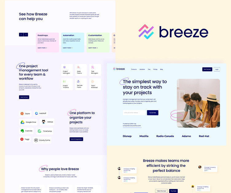
The simplest way to stay on track with your projects
The breeze was created because of a need for a simple tool for project management. By simple, we mean that it should be intuitive, easy to use, minimalistic, and made for people not for machines. We needed to know what's being worked on, who's working on what, and how much time it takes. We are freelancers and consultants and we have seen a lot of classical project management tools that are either too technical or complex to use. All of them have let us down. So we decided to create a simple tool that would be based on agile and lean principles and also would be usable by all our non-techy clients. We created a tool that would serve the user - quick and responsive, simple screens, and got rid of every configuration option that would complicate and distract you. Start using immediately, no setup is required. The tool we created shows you what's being worked on, who's working on what, where things are in a workflow and how much time it takes.

Colors and Typography

Homepage design
Along with the new identity I also worked on the new homepage design for breeze. I wanted to make the homepage match the vibe of the new brand identity, but the challenge was to not make it too playful or too corporate. Breeze is serious about what they do but also cultivates minds that can blend between the prudent and the playful nature of the company.
