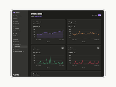
Introducing Qonto’s new dark mode via the dashboard


Hello Dribbblers 🖖
With our dashboard revamp, we wanted to take our automotive cockpit metaphor one step further by introducing a new color universe. And bringing a “behind the scenes” feeling to our clients when they monitor their business performance. The perfect opportunity for us to deliver something that’s been requested for a long time: dark mode. 🌘
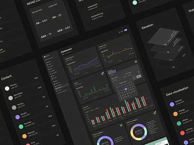
We approached the subject by focusing on three main color topics:
- A themed perspective - moving from classifying colors by their tones to a semantic approach, based on their meanings or ways they’re used in our interfaces.
- Color adjustments - by desaturating the boldest ones in order to reduce eye strain and provide the highest levels of accessibility.
- An elevation principle for each pattern - to always keep the elements on top lighter than the ones layered below, whether in dark or light mode. Just like in real life.
👉 Share your thoughts and press 🖤 to save it!
Special thanks to @alexisriols, @marionechevard and @lucassteuperaert for this overall project. Thrilled to have joined you on this path!
—
🔥 Ready for a new challenge? Qonto is hiring brand designers and product designers in Paris 🇫🇷, Barcelona 🇪🇸, Berlin 🇩🇪, Milano 🇮🇹. At Qonto, we also take seriously spontaneous applications.