


Apple & Eve Logo

A first logo concept for a company who help other companies/people improve their visual communication. They want to instill a sense of 'fun' or 'less stuffy' approach to this particular line of work.
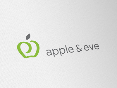
Given the rather obvious 'Apple' logo problem, it has been a little tricky to come up with something nice and unique, without causing any direct links to 'Apple' or clip art.
After looking at a heap of ideas, the most solid one was this use of letters to form the 'apple'. Formed from a lower case 'a' and 'e', rotate 90 degrees either way. The client would have liked some association to 'Adam and Eve' in here, but this has so far proven a little tricky to implement cleanly, without totally destroying the clean lines we have so far.
Would love to include a 'fig' leaf in this somehow for the 'eve' association, I have tried replacing the regular 'apple' leaf with a fig leaf, but just looks wrong. Also tried playing with some negative space with the fig leaf, but can't get it to really work.
The fact that the wording clearly defines 'eve', I feel it's not necessary to shoe horn in visual representation of 'eve'
Hoping this use of stylised initials could be enough as a clean, fresh and memorable mark.