E-commerce app redesign concept

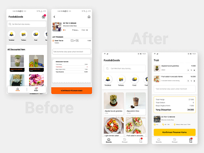
An Indonesia-based marketplace app needed a redesign concept. The presented screens are main page and cart. The new design follows the general style of «Maxim» — taxi and service ordering app, as was requested by the client.
In the process of reviewing the visual style, I've noticed a few structural issues I proposed to fix in the concept. Namely:
1. Make the bottom tabs bar and place the cart icon in it. Firstly, it follows the commonly used practice for e-commerce navigation patterns. Secondly, it's more consistent with the navigation style of «Maxim» app. And finally, it opens up more options for future growth of the app and its rising needs for new pages.
2. Make the Cart its own section, not just an inner page. It makes the cart more accessible, and removes the neccessity of placing a home page link at its top bar.
3. Move the information about the merchant from top to the bottom of the Cart screen. For user the most essential information in the Cart is the list of goods they're about to order and their price. Merchant was chosen before the goods themselves, so the user already knows who they order from. Nevertheless, the summary is still there should the user need it.
Greatly appreciate any feedback! ❤️
___
Come say hi on my LinkedIn!