Open Mortgage Brand Refresh

At Open Mortgage, I had the unique opportunity to lead the brand refresh initiative this spring. Here's where we started...

Our first goal was to update the logo. Leadership felt it was important to keep the icon and general feel. We approached this by rethinking our colors & fonts to better reflect the name-appropriate 'openess' we wanted our refresh to carry.

Afterwards, I spent time thinking of how the brand would then present itself across all materials. The goal was to create a seamless brand that would be easy for anyone, including loan officers, to pick up and work with. This meant providing them with not only clear direction, but a library of brand assets.
For that, I developed a library of brand assets, including what we now call accents, as well as shapes / frames, photo presets unique to Open, and a custom crafted illustration style.

Of course, to get to this point, I wanted to test it across multiple materials to make sure it fit together. Here's a sneak peak into some of the new pieces!
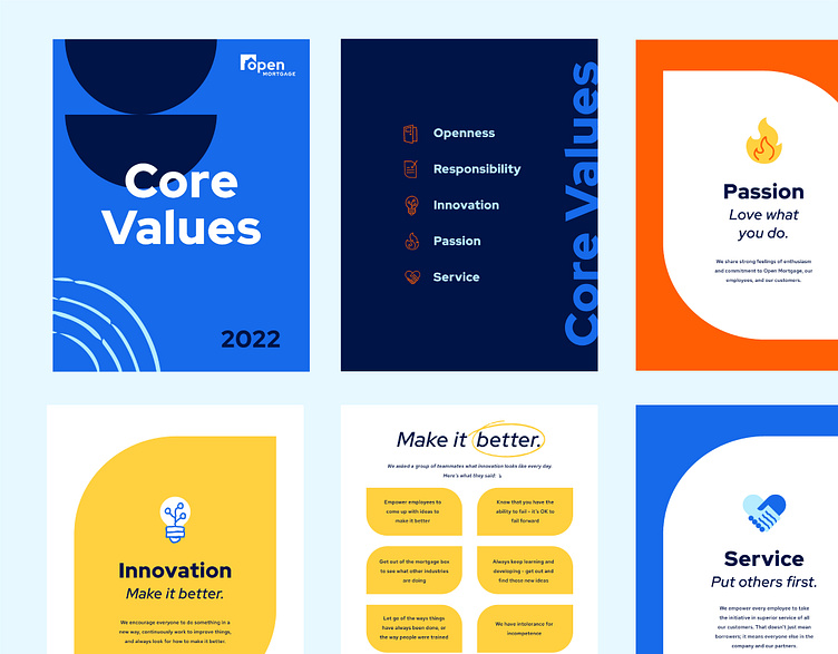
Sample Print Materials

As you can see, we prioritize white space. Accents (such as hand drawn arrows) are used to lead the eye or highlight specific information. Shapes are used to break up information, house photos, or add texture.
With a good starting point, it was time to see how all of these elements could play together, evolve, and expand.
Here's a preview of the next projects I approached with this in mind...
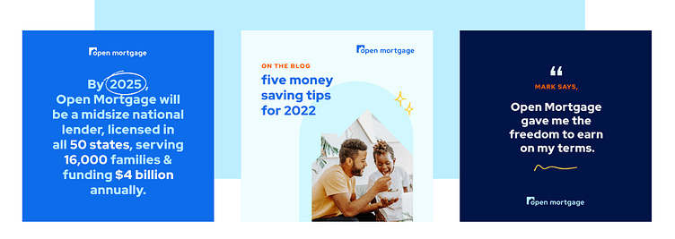
Social Posts
Vivid Vision Booklet

Core Values Booklet

I hope this has been an enjoyable glimpse into what we've been up to at Open Mortgage! Stay tuned for more soon.
A big thanks to Adam O'Daniel and Zach Rojas for input, vision, and guidance along the way!