Guia dos Tímidos - Brand Identity

Guia dos Tímidos (“Guidance for the shy”) is an online education project, made for the male audience, aimed at personal development in the sexual and loving area, for those who feel limited and dissatisfied with their social skills with women. The challenge was to develop a brand identity that contained the essence of the brand founder's life story, seeking originality and moving away from the banal image of masculinity present in today's culture.
The concept of the project comes from the life story of Márcio, founder of the brand, who witnessed a sui**** when he was 18 years old. A man fell next to him, while he was riding a motorcycle, after throwing himself off an overpass, and it was later discovered that he had given up on life because of love frustrations. This event generated a “ripple effect” in Márcio's life, influencing his decisions and motivations.
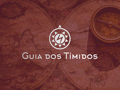
In the creation of the brand's symbol, we tried to bring a tone of mystery and belonging to a secret and united club, since it is something aimed at the intimate of the spectators. We also brought dynamism, conveying aspects related to the epic, disruptive and anti-heroic ideas, avoiding the "typical things" without losing the simplicity and central essence of the project. The logo does not seek to be easy to understand for everyone at the first contact, but rather to arouse curiosity and questioning, instigating the viewer.
The compass is closely related to the idea of a guide, being used to bring the concept of direction to the brand isotype. The lightning represents the fall that caused the impact on Márcio's life and the echo that it caused in his life, with the sound (message) hitting hard from the first moment and propagating in time/space, gaining proportion. The sun appears as an element for the meanings of lighting, direction, central source of knowledge and inspiration, linked to spiritual and transcendental issues, of central connection with life and warmth for the soul. The triangle above represents: the north of the compass, a direction that, when identified, gives meaning to the others; the suic*d*l, isolated from the other “triangles” and out of purpose; and the brand's mission, to speak openly about this situation, preventing it from happening again by enabling all men to overcome their limiting beliefs, conquering the social skills necessary to develop a dignified and solid relationship with a woman.
"From the conception of the idea to the delivery of the project, what highlighted Lucas' work for me was the care taken to bring personality to the brand through design, with incredible artistic taste. The project was delivered on time and with impeccable presentation, in addition to emotional involvement with the brand's purpose. Everything above expectations, I recommend it." - Márcio Matos, brand owner