Daily UI #017 - Email Receipt

This was inspired by book printings that have color edged paper. If you happen to know a place that sells plain pink or black edged paper please let me know.
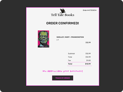
This idea seemed like a good fit for a gothic themed bookstore so I went with Frankenstein and the store named after Edgar Allen Poe's work. While I like to keep fonts to a minimum it made sense to have a different font for the book store logo, and I felt the appreciation text came alive with a handwriting font and also gave the store more character. I can almost imagine the type of person saying these words, someone very kind and a little rough around the edges.
The only notable UX feature I discovered was to increase the kerning on the order number so it is a lot more readable. It makes a lot of sense and I think it should be considered for all order and account numbers.