Editorial Design (Magazine) 2/3

Wabi-Sabi is a personal project that shows my interest in layout design, and more specifically, unifying the text with the images in a manner that creates curiosity throughout the pages until the last one is reached and you wish to read more.
While the article was written and published by Anne Walther, this is an editorial design for a fictitious magazine I imagined.
The subject was chosen as a result of my wish to learn more about the Japanese culture, as the main desire was to bring together two of my hobbies: design and Asian cultures.
The challenge was to illustrate through text and image, brought together, interacting with each other, the meaning of the concept of Wabi-Sabi, the acceptance of "imperfect, impermanent, and incomplete", while not breaking any design principles which seek the opposite: perfection.
This is why I chose to have differences in the negative spaces that border an element or all the elements of a page.
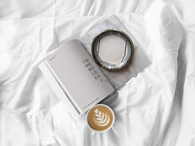
Secondly, bringing together large images with less text also created dynamics through contrast.
Moreover, I chose to combine smaller images with information that surpassed them in the spaces it occupies for the same aforementioned reason: dynamics through contrast.
The colors were also chosen accordingly to the concept and they can be seen in the objects added in the magazine and which are essential for this concept: materials that seem to be imperfect, too plain to be used for creating beauty but in the end creating true wonders.
To get the latest updates on my projects, illustrations and services I offer don't hesitate to follow me.
I can also be found on Behance, Instagram and on my personal website.