Logo Design for Goldmund


Logo Concept for a German manufacturer of healthy, small-batch artisan delicacies. Think sauces, spice blends, syrups, liqueurs, and more – made from local and organic ingredients.
Goldmund’s products are sold on farmer’s markets and in gourmet food stores. The target audience is middle and upper-class consumers willing to pay more for good food. Think gourmands and eco-conscious individuals who want to be sure they’re consuming food free from additives.
The client wanted an attention-grabbing logo that draws people to take a closer look, not by being loud, but through elegance & sophistication.
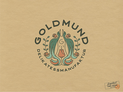
The logo features a simple line-art illustration of love birds in the German folk-art style, which ties in with the brand’s values of preserving traditions & local culture. To resonate with the mature audience, the color palette consists of muted teal, grayish-blue, green, and orange shades.
For an element of luxury & sophistication, the chosen font has a classic vibe as it was inspired by vintage metal signs and sign painters.