Napa Vine Trends

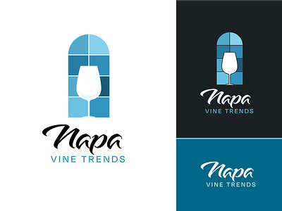
Logo concept for a wine blog.
Creative brief asked to stray from the "stereotypical" wine logo - no grapes, no vines, no leaves... no earthy colors, no red, no scripty fonts.
They wanted modern and clean, while simultaneously "evoking the feeling of an empty Riedel sitting on a perfectly placed table”.
I missed the mark, as the logo was rejected, but I like how it turned out regardless.