Just One Car - Logo Redesign

A few months ago I had the pleasure of working with Davide, admin of @justonecar, on the redesign of the logo for his instagram page.
The main issues with the old logo were:
❌ Poor connection to the automotive world and to the values the page conveys
❌ Poor immediacy and memorability
❌ Not working well in black and white
How did I solve these issues?
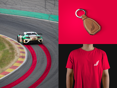
Starting from the origins, I decided to keep the shapes related to the letter "J" and to develop a logo that:
✅ Is related to the automotive world, in particular supercars
✅ Tells a story
✅ Is bold and memorable
✅ Convey dynamism and speed
✅ Works well in black and white
✅ Works well in the instagram profile photo
💭 What do you think? Let me know in the comments