FRUGO Alternative logo

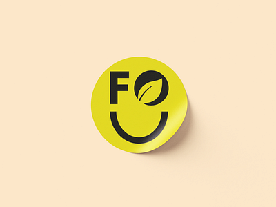
This logo the client ask it to be more fun and easy. I used the F of fruit and the O which has a leaf refering to the fruit store.
This logo the client ask it to be more fun and easy. I used the F of fruit and the O which has a leaf refering to the fruit store.