Identity for orthodontic project

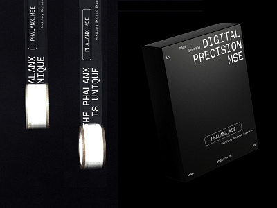
We had to develop an identity in the spirit of innovation, which would be clear to our TA - orthodontics, at the same time separate from the classical medical aesthetics.
Therefore, in visual solutions, we followed the function and inspired by the interfaces of tomographs, X-rays and so on. That was how the black-and-white scale, accent color and mono-wide font had appeared.
Check out our full case 🔗https://twid.studio/en/projects/phalanx/