A.A.C.

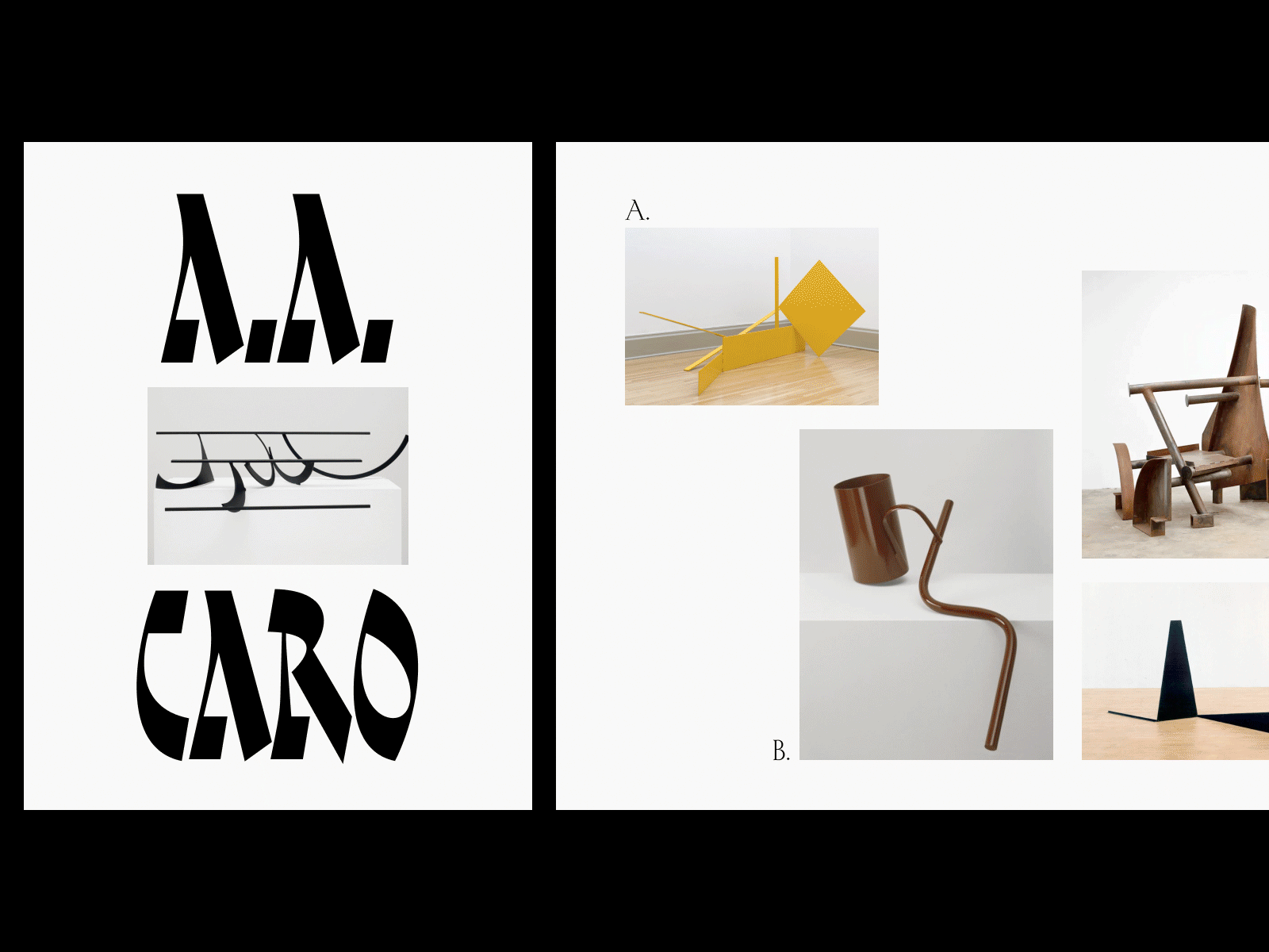


Sometimes decisions about type are purely emotional. From a historical point of view, Capitalis Rustica seems like a rather peculiar choice to compliment Sir Caro’s work compared to, say, utilitarian grotesques. But when you take a closer look you might see the surprising likeness between the letterforms and the artwork. After all, Caro’s process relied on bending a perfect geometric form manually, just like a scribe pushing quill down a sheet of paper.