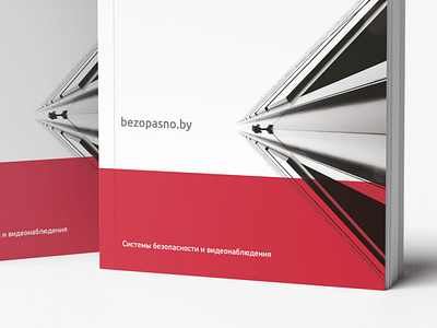
bezopasno – identity and print design
https://antongolev.com/en/cases/bezopasno
What should be the design of the company’s identity, which deals with security? Definitely translating reliability and evoking trust, especially since our client – bezopasno.by – fully complies with these parameters.
So, what we had at the start. The company has been supplying and installing video surveillance and fire safety systems for over 10 years, and offers a full range of accessories. For us it was a challenge, because creativity and creativity as far as possible from the client’s activity. We had to put together the structure of the catalog with thousands of products in such a way that it would be functional, understandable, easy to understand and convey the values of bezopasno.by.
First of all, we worked on the palette, assigning each product category a different color, and proceeded to the catalog. We created key spreads with the main elements, and collated the basic concept.
To distribute a huge number of products, we developed a whole package of icons corresponding to the characteristics of products. The goal was achieved. The structure of the goods repeated the usual web-display of online stores: with simple product cards, clear descriptions and a set of icons. But we do not like standard solutions, so we went further.
We transferred the idea of icons to the full list of products, even those that do not have the usual electronics characteristics. This made it possible to bring items from different categories into a coherent, unified view that forms the company’s image. The developed icons became an effective functional tool for filtering and selecting products. They make it easier for specialists to check compliance and usage capabilities, and for managers to visualize and calculate budgets and evaluate the appearance of equipment and materials.
Special attention was paid to the development of technical schemes. We were limited by strict technical regulations, which are important to observe when drawing the key elements. As a result, we managed to make them interesting and consistent with the style of the catalog and the brand. In addition, with the help of photos we expanded the visual representation of the application of the equipment in different areas: in shopping centers, cafes, household and industrial premises.
As a result, the updated corporate identity is a reflection of the status and reliability of the company, translating the values of the brand in every detail.


