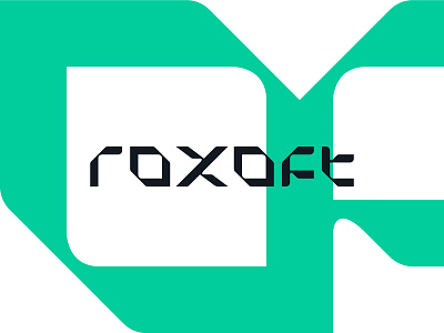
Roxoft logotype design
Diamond is a sentimental element in Roxoft's identity. It was necessary to keep it but in a clean and abstract form.
The letter “o” in Roxoft's name is a central element that, in this case, represents a simplified diamond shape, a gem. The letter “o” dictates the shaping of the rest of the customized letters.
The logotype is constructed from a customized typography. The typography is inspired by shapes that are visible when a raw diamond is cut and shaped into a gem. It was necessary for the logotype to evoke a clean tech and gaming feel.
branding
custom type
design
diamond
gaming
graphic design
green
logo
logomark
logotype
rocks
tech
type
typography
vector
visual identity
View all tags
Posted on
Mar 28, 2022
More by Barrage View profile
Like


