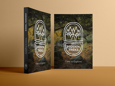
Hidden Treks - Hiking Book Logo Design
Hidden Treks* was first started by a group of expert hikers and trekkers based in the USA. They’ve been running a successful blog for a couple of years and have recently set up a website offering guided treks to both popular and unseen places in the vast wilderness of America. Since the design of their new website, business has boomed and they have been gaining a lot of traction from people asking for tips overseas. The main area of interest has been the UK, so they’ve decided to release a limited edition printed book offering the least explored routes in the British countryside, alongside helpful advice and hints to those wanting to explore the great outdoors.
For this project, the brief specified a simple line art style, alongside complementary, sans-serif fonts, so I developed concepts in that direction. I created a simple nature scene and used dashed lines to convey the 'hidden' nature of the trails that would be in the book. I developed this into a badge style logo, but as an added twist used a walking boot shape to frame the scene. The name 'Hidden Treks' is contained with in the heel of the boot, and this can also be used as a standalone element where a smaller format of logo is required. For colours, the brief suggested the natural green hues of the woods in the UK but with an alternative, bright colour that pops against the more neutral, natural tones. I chose the colours by using photos of woodland walks for inspiration, settling on a bright orange, from autumn time, for the accent colour.
*This is a personal project based on a brief from the brief box.


