Prudent Products Incorporated Topper 3B Packaging

Prudent Products, provides the do-it-yourself novice with the necessary tools and information to perform tasks for themselves in a timely and cost- effective manner. More over, every product is made from the leftover materials that would normally end up in landfills.
When my friend, ally and colleague, Kyle Kurokawa reached out to me to assist in the design and development of the brand, packaging and Ecommerce website of Prudent Products, I quickly noticed that the PPI (Prudent Products Incorporated) brand voice was in dyer need of refocusing.
You see, PPI was already properly optimized in terms of meeting their consumers needs with procurement of the raw materials, production of the products and their shipping within the continental US. But their marketing strategy lacked the highlighting of their novice friendly and American made core values. Thus leaving thousands, if not tens of thousands of dollars on the table and missing their opportunity to create a base of loyal customers.
With the goals of breathing renewed life into the brand, in tandem with providing PPI a packaging refresh and Ecommerce website we set out to push Prudent Products into the 21st century. In doing so we adjusted the company’s target audience and combined the existing targets of nationalistic, rural American men, with that of the individual that just wanted to do their construction projects themselves. Thus, creating a new target that better aligned with PPI’s approach to being a novice friendly, home grown and a do-it-yourself kind of personality.
Upon completing PPI’s retargeting, Kyle and I leaned into better reflecting their audiences’ wants and needs into Prudent’s online presence. Giving Prudent Products a total overhaul that funneled potential customers through a user journey that not only taught them what PPI’s products did, but guided them through proper use/maintenance of the products and the benefits to how those products made their do-it-yourself projects easier. Ultimately ensuring that PPI’s customer base was thoroughly informed to the fact that their money wasn’t just going to a new tool, but to a community that cares about more than just doing a project right.
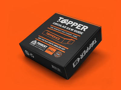
But wait. What about fulfilling PPI’s ideals about being novice friendly with their packaging? How did you go about that, you may ask. Well, those valued customers helped direct exactly how Prudent Products’ packaging was developed. Through the use of focus groups, we found that most of their consumer based preferred the packaging to focus on guiding the customer through the process of using the product. Rather than explaining what the product did. Which then helped us land on a style that exuded the secure and direct feelings of a user manual with linear illustrations, clean and legible descriptions, along with a color scheme that made consumers feel confident in their skills to get the job done.
This system ultimately came to fruition in Prudent’s Topper 1A, 1B, 2A, 2B, 3A, 4A30, 4B30, 4C30 and 5A packages, with its clean and simple aesthetic.
––
My Role:
Brand Strategy
Brand Tone
Art Direction
Illustration
Packaging Design
Web Design