Benjamin Moore logo re-work

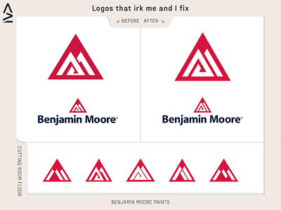
Saw this logo the other day and it’s been stuck in my mind for a while, unfortunately because it of the weird change in thickness at the bottom in the middle.
So I rolled up my sleeves and did something about it! You wouldn’t think it but this suckers got some tricky math to it. When building my own version of it I can kind of see why the line thickness on the original was made like that. I don’t think what I’ve done is perfect and there’s maybe some tweaking that needs to be done to it but it’s a start.
I didn’t want to touch the wordmark just because it wasn’t bothering me when seeing it but that too could have some work done to it.
Anyway this was all in fun and I’m not at-ing you Benjamin Moore.