Wine Label Design : Walnut City Select Reserve

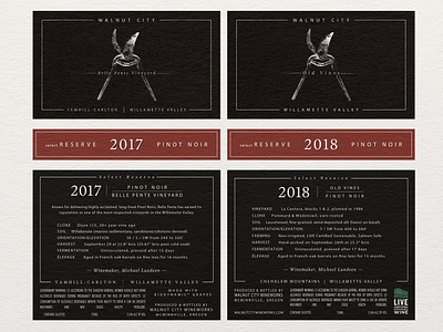

The Select Reserve ‘Black Label’ was developed for a new line of exclusive, top-tier wines. There was an opportunity to do something different and depart from the core label design. The direction of the design was to be understated, refined and subtly branded. Silver foil debossed on black created a beautiful visual and was the perfect application for the classic secateurs. A matte varnish minimized gloss and sharply contrasted the bright shine of the foil.