Intercredit Securities Careers Page

Intercredit Securities or Intercredit for short, provides lending solutions designed to get businesses the capital they need to increase their earning potential. With 18 locations around Australia, they’re perhaps the most relevant lending brand you’ve never heard of.
When they approached me for branding, I quickly realized what was needed – in addition to a visual identity and website, they needed a clearer message and a more cohesive brand strategy.
With an effort lead by myself and my marketing manager Michelle, alongside our great partners at Intercredit, through intensive workshops and constant communication on the daily. We were fortunate enough to have identified what was good and true about the work that Intercredit does each end every day. Through this, we helped define their purpose – leverage data to allow business ownership to optimize their potential earnings post the reception of their commercial loan.
Our strategy set the table for their brand that was both inventive and appropriate for their business goals. We evaluated their visual language, made some recommendations and quickly got to work. The word mark is a simple and elegant representation, utilizing descending weights to convey the meaning in their name; specifically their ability to help clients get to the simplest, most efficient and most effective articulation of an idea.
Today, branding is more about the verbal identity than a logo. Anyone can make a logo. So the audience they were speaking to played a big part of crafting our tone of voice. Based on the data centric nature of their business we felt the industry already had enough data speak going on, so we leaned towards a friendlier approach, one grounded in a more conversational tone. To that end, our font choice and pairing, was as important, if not more than the logomark. Verbal identity is the new brand identity, so in this case, we chose a lovely robust serif called Biryani by Dan Reynolds and Mathieu Réguer combined with the humanist typeface, Open Sans by Steve Matteson. Both work well independently, but they’re even better together.
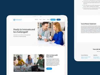
The design system ultimately came to fruition in the website, with its confident yet refined aesthetic. The website celebrates their mission and shares the unique combination of creativity, technology, and people that differentiates Intercredit from their competitors. All the elements including, brand, typography, color palette, photography, data visualization, and the structured sitemap well to support the new brand strategy and messaging platform. I’m so excited to have formed such a strong partnership with them and can’t wait to see the Intercredit grow and evolve from here.
––
My Role:
Brand Strategy
Brand Identity
Art Direction
Copy Writing
Photography
Web Design
Development