Daily UI #002

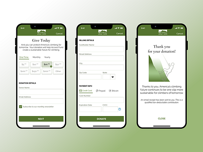
Kept the vibe minimalist with small shadows and very little beveling. Wanted to make as few spaces between the user and the "donate" click but in the future I might want to separate the billing details and payment info.
Kept the vibe minimalist with small shadows and very little beveling. Wanted to make as few spaces between the user and the "donate" click but in the future I might want to separate the billing details and payment info.