Book Design: Master's Degree Textbook

Some information-heavy manuscripts are more of a challenge to present with visual simplicity.
As most book design projects do, this one began with Microsoft Word files. And, as is usually the case, after some back-and-forth with the author and the editor, plus quite a few questions for them both, those Microsoft Word files end up in Adobe InDesign, but not before a suitable structure is devised within which to present the information.
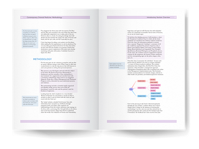
For this project I also had create all of the charts, diagrams and illustrations from written descriptions I was given. The charts were created in InDesign, the diagrams and illustrations in Illustrator and Photoshop. After assessing all the information that needed to be presented, I chose the structure of an eleven-column grid system. This allowed the main text to be the focal point, provided plenty of space around it, enabled the use of pull-out quote boxes, and made the five-level heading hierarchy typographically simpler. This grid is defied by the tables which are centred on the page to create more visual interest, and the in-line diagrams which are allowed to spill out into the negative space.
The main body text is Caslon Pro. Both Julius Sans One and Europa are used for the five-level headings hierarchy. Europa is also used for text clarity in the body of tables, and in the running headers. In the tables three weights of Europa are used to structure information. In an unusual move for me, a fourth font is also used (though only three times in the entire book) to create visually-different section dividers to break the book into thirds.
Within the structure of a grid system and a gentle, warm, and subtle palette, all the elements come together into a cohesive, and purpose-appropriate, design: - Sections divide the book into broad concepts. - Highlighted areas of text and pull-out quote boxes emphasize key ideas. Running headers at the top of the right-hand pages let the reader know which section and which chapter they are reading. - Diagrams, charts, text, and the headings hierarchy, all fit cohesively within a design that is both visually pleasant and that also makes comprehension easier for the reader.