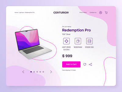
Redemption Pro store page - Desktop version

One of the first design principles for content-focus pages is that the UI must be very clean, to avoid drawing attention from the product itself, but that end up resulting in a few souless pages around the internet, with no colors or no visual assets at all.
So, after assuming that the we have a product which is already well known from the public, I've imagined a fictional store page with a reduced amount of text and a background that relates to the laptop screen. That's the result, and I hope you like it. All feedbacks are welcome. Cheers!
Contact: Linktree / andreped.design@gmail.com 🙋♂️