Atease brand identity: stationery & other applications ✨


Brand identity project for a new startup that aims to create a new concept of love hotels, without the taboos.
I helped the client in the process of defining the brand's personality and values, target audience and communication style. We worked together to find a name and started exploring different concepts to express the character of the brand. These concepts developed into visuals: typography, illustration and colour.
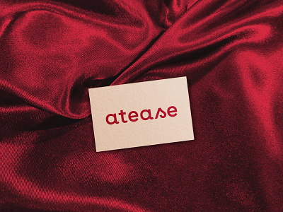
The naming plays with the words "at ease" and "tease", expressing two main aspects of the brand: feeling safe and free, and intimate relations. The logo is simple and type based, with some curvyness referring to human shapes and a custom cursive "s".
Atease is a forward looking brand, so our intention was to visually set it apart from the traditional look and feel of love hotels. While working with the client, we paid special attention to the emotional part and explored the feelings it should convey. The brand aims to look young, friendly, confident and open to all, regardless of gender and sexual orientation. It's freedom to choose and to be who you are, in a safe and private space. We chose to express this using fruit as the core concept of creative direction, achieving a playful vibe with bright colours, fonts that convey warmth and friendliness and simple illustrations, referring to sex and human bodies in a fun, not too explicit way.