Logo Redesign Concept- Institute of Oriental Studies

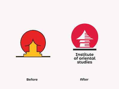
"Institute of Oriental Studies" previous logo was so weird. Now they've redesigned their logo which so good. But it's little far away from the previous once that shown here.
If you see the original carefully you will see some humans organisms. Very disgusting.😂😂
So here's my concept. Tried to keep simlarities with the previous once.
.
▪️ Available for work
▪️ My portfolio link Click here
▪️ Please show some Support & follow for more
.
Have a great day!! 🤗🤗🥰🥰