acf fiorentina x kappa concept set

a couple days ago, i saw one of my old designs from 2016. i love redesigning my old designs to improve my skills. it's always fun to remember what i thought back in time and combine the thoughts with my current skills. the third kit (golden) burst with this praxis.
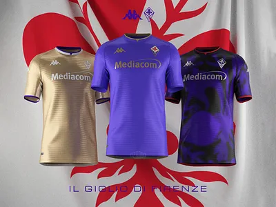
glossy golden fabric with glossy white details and violet trims. i complete the look with white shorts and white socks in my mind.
i wanted to achieve a intense dark look with violet graphics and red details. i designed a hooped graphic at first, where i limited the giglio in the hoops. then i abandoned the idea and spread multiple giglios with grainy gradient.
glossy fabric emphasises the graphic. red trims and red metallic prints would complete the look, but chrome prints looks more impressive for sure. black shorts and black socks with violet details complete the look in my mind.
since i have a dark violet shirt on the set, i wanted a light tinted home shirt but it's not easy to recast an almost hundred-years-old shirt. therefore, i reviewed the previous home kits of fiorentina and i found what i wanted in 2008-09 season. i took the colour scheme and layout of the mentioned shirt, lighter tint of violet, golden collar, golden prints... but in a contemporary way. this is how i got the home shirt.
there are red giglios on the back of the neck of every shirt. these were connected to the slogan of my unofficial campaign: il giglio di firenze (it. the flower iris of florence)
i worked on the 2021/22 template of kappa sports which i designed on clo3D. i used clo3D on the model and i also rendered on clo3D. i used adobe illustrator for graphics and adobe photoshop for editing.
you can check out the detailed renders on my instagram: instagram.com/ozandographics