Past Reflection Typography

Toying with using Harriet for the titles.
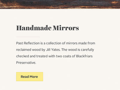
Pastel colours such as sky blue and rose pink were requested, but they don't present enough contrast and seem inappropriate next to the wood. I'm trying to compromise with an off-white and a stronger highlight.