E-commerce - Product Details & Shopping Page

Hey, everyone✌️
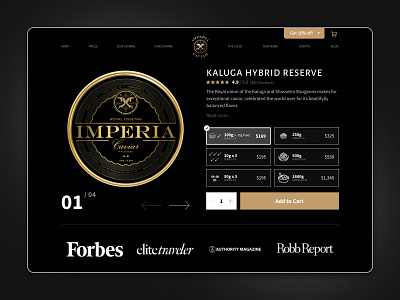
This is another fresh view on the shopping page of the Impervia Caviar brand. First intentions was to maintain luxury feel/identity but in the same time make interface more native, friendly and most importantly - convert better. Control was feeling a bit outdated, prices & quantities are all over the place, and there is a lot of unnecessary text that could be discarded from the page.
New variant was targeting to solve the main UX pain points. We created several custom icons to help user easily navigate to the exact quantity of the product and reference this with the price. In addition to that we've cut lot of unnecessary text description for simplification, so page is more scannable. And we brought social proof was brought above the fold as an additional factor to incourage purchases.
Unfortunately client discarded this idea, but what do you say? Do you like the new revamp? Please share your thoughts & feedback on how I did down in the comments below! Thank you all in advace 😊
Control Page: https://imperiacaviar.com/collections/caviar/products/ossetra
💌 Have a project idea? I'm available for new projects, just hit me a message via any of the channels below, let's discuss your idea: