Shadow Hand Kung Fu Logo Concept


Logo design concept A for Shadow Hand Kung Fu.
Shadow Hand Kung Fu (SHKF) is a new martial arts trainer in Brisbane offering Kung Fu and Tai Chi training to adults of all ages, races, sexes & backgrounds. Whilst most martial arts trainers teach action and reaction, SHKF sets itself apart by also focusing on the important and often overlooked survival aspect of sparring, as well as mental discipline and fortitude.
Our brand identity must convey a level of depth and meaning, encouraging curiosity and a desire to explore the symbol/business more. The yin yang is an important symbol to include as a core representative of the SHKF philosophy.
We will set our brand apart by avoiding the usual cliches that are overused in the industry, creating a contemporary symbol that resonates with our core demographic of males aged 16-40, whilst not isolating others who may be interested in learning Kung Fu with SHKF.
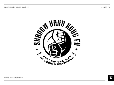
This first concept uses the Yin Yang symbol as the primary focus of the logo, but the black and white segments are made up of two interlocking fists. This is symbolic of two people sparring, and the attack, defence, action and reaction aspects of their teachings. The dark hand is also a reference to the business name, acting as the ‘shadow hand’. The emblem is finished off with a contemporary stylised type, fitting for the martial arts theme, and a tagline for the SHKF philosophy.