


CLANCY — Brand Visual 1

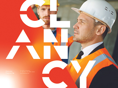
Clancy is an old personal project I worked on before and felt it needed a refresh. I have been seeing a lot of exciting typography and usage of blur and grain in visual layouts so I wanted to use this opportunity to do something similar.
The word mark itself has not really changed, it still has a 'constructed' look which I wanted for a company which is industrial in nature and develops large scale projects. I almost think it looks a bit architectural in it's appearance but different is good in my opinion.