JU logo

Hey Dribbblers!
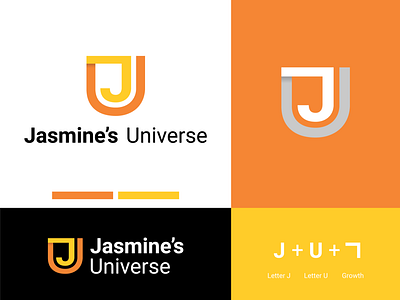
JU is a digital marketing agency. The idea was to create a logo combining the letter "J", the letter "U" and an arrow that reflects the concept of growth.
So, I made some kind of FUSION between them to find the logo symbol.
As for the text, I chose a font in harmony with the symbol.
Please note that the yellow palette refers to creativity and dynamism.