Job Search Platform Mobile App


💌 Have a project idea? We are available for new projects info@ronasit.com | Telegram | WhatsApp | Facebook | Linkedin | Website
Are you excited when looking for a job? The usual job application process can feel boring and tiresome sometimes. We wanted to bring something more engaging and came up with the idea of a job matching mobile app!
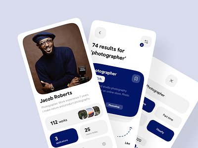
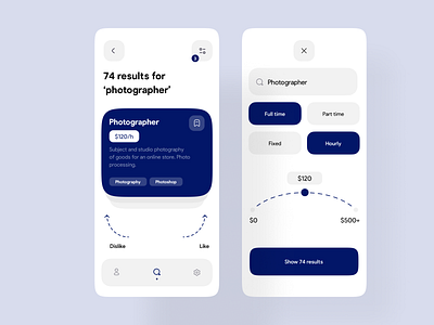
The shot shows three screens: the first is a profile page with the user's experience and resume; in the center, there is a job swiping page; the left screen is a filter page with the applied search filters.
We picked two main colors for the app - white in the background and dark blue for interface elements. This minimalist two-color combination is a perfect solution to help organize the content and make the app more intuitive for a user.
This concept presents a more entertaining and gamified approach to job-seeking by implementing the iconic swiping flow. Liking or disliking a job post feels less boring than the ordinary process implemented in most apps.
How do you like our idea?