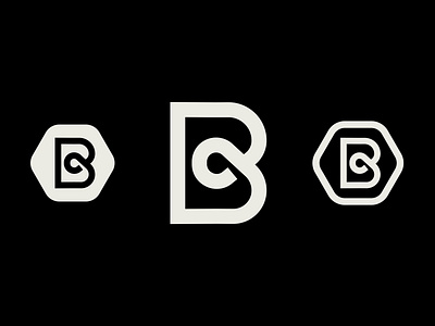
Bel-Aire Logo
I recently had the opportunity to design a logo for a local non-profit who focuses on community development. They needed something that could become associated with who they are, what they do, and what they stand for. Taking everything into account, we came to this solution! The loop in the middle is symbolic of their commitment to the community illustrated through a 'knot'. The hexagon shape comes from the fact that the community they've come alongside was historically an industrious mill town. And you know, for some reason, industry means sharp hexagonal shapes. But ye, the best design tells a story, solves a problem, and has a purpose, and it was sooo sick to tackle those core tenants through this project! Thanks to Bel-Aire for the partnership!

