Mobile Boarding Pass Design

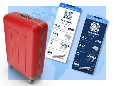
Daily UI - 024 - Boarding Pass. Luckily, the flying experience is fresh in my mind. So, I designed the Pass for the experience I wanted. I'm aware that proper UX would involve much more research, but this is a daily challenge. I created my version of the boarding pass with several changes gleaned from my travels. First, I decided the Boarding Pass should chronologically follow the flying experience from after check-in to boarding. In addition, I included a map link beside the gate because every time I had a connecting flight, I had to ask where to go, and there was anxiety surrounding not knowing. Next, I arranged the boarding group by the boarding times because I always find myself searching for this number when boarding begins. Finally, I included a visual graphic showing the location of the passenger's seat in relation to the physical plane and a link to change their assigned seat.