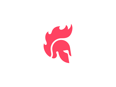
Improved Helmet

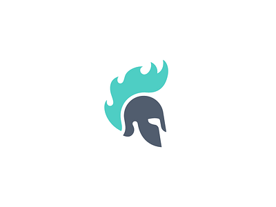

Here is the new and improved (final) version of the spartan helmet.
You guys gave me a lot of solid feedback to work with, thanks!
See the attachment to view all the different variations of the logo. Ultimately we decided on some small tweaks that really improved the mark, while not venturing too far from the previous version. The client felt this final version best represents their brand.
· The flames are improved, while staying simple and not too realistic.
· The eye looks stronger, but not angry.
· The flame starts a bit higher, making the overal shape more pleasant.
· Two colors to make the mark stronger and even easier to recognize.
Feedback is very welcome!