MOMOJI BRAND IDENTITY

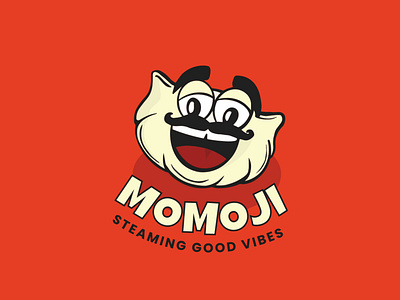
Viplavam food labs approached me with their plan to start a momo brand and their need to do branding for it. They are a B2B business outlet that mass manufacture momos and supplies to local stores across Trivandrum. Viplavam Food Labs wanted a logo that is FUN, RELATABLE, and EXPRESSIVE.As per the requirement, I designed a logo that was inspired by the shape of the momo and incorporated the facial features of an Indian Uncle to add the vibe of a "JI".
To view full project visit sardinemother.com