Aplomb - a blog page design

Prompt: Blog post
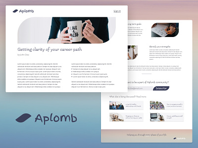
For this design, I timeboxed the entire process to quickly complete the UI design challenge. As a result, I was significantly more efficient than the previous day. Here’s the final work — it’s for a fictitious blog. Details and thought process elaborated below.
Basics
Name of the blog: Aplomb To have self-confidence or assurance, especially when in a demanding situation
Element: Petal I used this element in buttons, logo, bullet points and image frames
I’ve had a lot of fun discovering different styles of fonts. I dared to use fonts that I typically would refrain from exploring. I used 3 main colours and their shades - purple, dark grey and white.
Section 1: Above the fold
This is the most important part of the blog post with image and title. This section should pique the reader’s interest to read further. Here I’ve used the same design element for the image banner as well as bullet points in the description.
Section 2: Details
This section contains paragraphs with images. Typically, images are either in rectangular, square or circular frames. I created different blocks and frames to give a unique look to this section.
Section 3: CTA and relevant links
This is the final section with CTA and links to other blog posts. I have slightly modified the image frames here and limited the usage of curve to only one corner of the image, so that it’s not excessive.
I hope you enjoyed reading this post. If you'd like to get in touch with me, you can DM me on Twitter here.