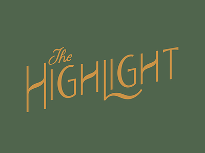
The Highlight
Logotype for a culinary estate my family are in the process of developing. Inspired by turn-of-the-century typography, French cafes, but still with an approachable simplicity. It breaks a couple of type rules, but I'm really pleased with how it all works together. More to come!
View all tags
Posted on
Oct 12, 2021
More by Jon Dicus View profile
Like

