Camp Rightsleeve Rebrand

The previous Camp Rightsleeve branding was used for only 5 years, but lacked a contemporary flare, its pallet was limiting, and didn't reflect the current trend that our industry and customers were looking for.
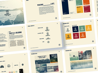
The objective was to create a design direction that was diverse and easy to use. I wanted the pallet to feel sophisticated, but feel at home in the outdoors. The brand needed to stand out, but also feel as though it has existed for a long time.
the final result is a simple brand with a lot of options. High contrast in the primary pallets for accessibility, and a full direction for marketing assets. I created a process for photographs that takes stock assets and makes them a part of the brand, and creating several typographic scenarios that we can use for years to come.