Lilypad
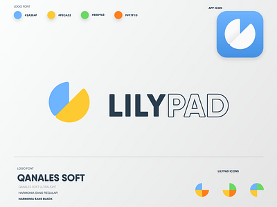
Lilypad, an educational software company, needed a new logo, iconography and branding elements that tells their story: Lilypad develops educational games that focus on different areas of development, and encourage screen time self regulation!
I chose primary colors that nod to education, childhood and development, and went with simple and informative icons. Each one shows which developmental areas a Lilypad product focuses on.
The color is complemented by softer grays and clean fonts, that demonstrate that Lilypad takes their work seriously. Their games are fun, and they take education, development and digital life skills seriously.
More by Sam Tessendorf View profile
Like

