Practice brief: UX and UI design challenge/ airline booking page

Practice UI brief for Briefbox.
The brief was:
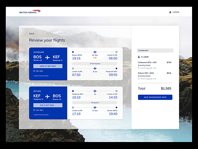
Design a checkout/booking page for a major airline. This airline perceives themselves as a progressive company who are always looking to be at the top of their game. Competition is key so they need to stand out as a sleek, innovative airline. There’s a deceiving amount of detail in a booking page. Spend some time looking through existing major airline booking pages to help give you some guidance for content. Think about what info you’d expect to see, flight timings, any stops, airports as well as number of passengers, baggage details and total cost etc.
I decided to use British Airways as my brand for this. I adhered to the colours specified in their brand book, and used a similar typeface to theirs. As someone with ADHD and dyspraxia, I need things to be laid out incredibly clearly to be able to absorb them so information architecture is really important to me. I spent a long time researching and refining the structure to make it as clear as possible. A lot of the example briefs for this particular challenge had the payment details on this page as well, but in a standard user journey on an airline booking page, that comes after the passenger information has been added. It seems to usually be book flights > add passenger information > pay. For that reason, I reflected that journey in my outcome.