Furniture Landing Page


💌 Have a project idea? We are available for new projects
info@ronasit.com | Telegram | WhatsApp | Facebook | Linkedin | Website
A landing page is a 100% must-have for any modern business. With the internet being the number one media today, one cannot escape but advertise here. We tried to imagine how a furniture store landing could look like.
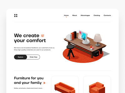
The shot shows the top sections of the landing page with a navigation bar, a brief introduction to the company with an illustration and catalog shortcut button, and a catalog description with product category cards.
We picked a balanced color palette with black, white, and accent orange colors. The white background helps to structure the content and attract the user's attention to the interface elements and illustrations.
This landing page has a minimalist look that makes us pay attention first to the few illustrations and text blocks presented that can interest our potential buyers and engage them into exploring more about the products.
What do you think about this landing?