Happy Hound | Logo Design

Logo Design:
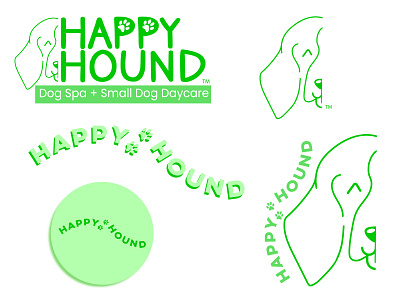
The goal for creating the logo was to capture the spirit of a happy dog while keeping it minimal and memorable, as well as creating alternate logos that are versatile yet cohesive for different platforms & printing. I created some simple line art for a minimal and modern look, showing not only a dog, but particularly a hound breed toalso encompass the company name.
Client:
Happy Hound is a family-owned dog spa & daycare located in Oxnard, Ca
Challenge:
Since the logo is a clean cut of the left side of a dogs face, it could limit the logo placing when it comes time for printing or marketing materials as well as social media icons.
This was solved by creating cohesive alternate logos that can be used for round and square icons.
Process:
I aligned the company name along the arch of the dog ear, while adding playful paw prints to break up the text.
This allows for use in square icons if the original full logo is too rectangular for the platform in use.
Once the company name is flipped right-side up, it creates a still-recognizable visual identity. Even without Happy Hound’s original line art.
Placing this text wave right-side-up within a circle not only helps with a versatile shape for round icons, but also gives the appearance of the wave a tennis ball has - subtly showing the daycare side of their business.