Profile Page / Daily UI challenge Day 6

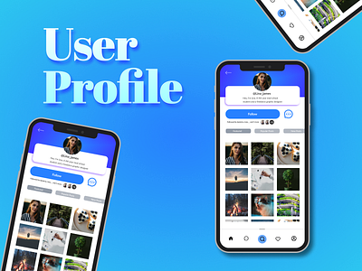
It looks good to be honest, two corrections I would like to do would be change the nav bar search icon a bit and maybe make the username and bio a bit more bold and readable and also the the message icon next to follow button looks a bit ugly, I would like to replace it with a better icon or change its stroke and fill color.
Also the text on the mockup looks kind of funky but that place was looking kind of empty so I had to put something in there.
But never the less it is decent