Youth Centre Web Design / Responsive Design

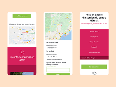
1. Contact my local centre.
2. Opening Hours / Search for my local centre.
3. Top navigation as seen on the job offers page.
Seeing as the target user for the product was young adults, it was important that the site function well on mobile devices.
The design is meant to display information clearly, with well indicated buttons (often using the bold bright green hue) so that users can find contact information for their local centre or submit contact forms with ease.
As one of the primary goals was to display information clearly and easily, the buttons are large and bright, body text in clear contrast, and menu items well spaced with fully functional search features.
- Laurie